Tips for Choosing Calm Colors for Your Home
Creating a calm and inviting atmosphere in your home begins with the colors you choose for your walls and interiors. Colors have a powerful impact on mood and can either energize or relax us. When aiming for a peaceful living environment, selecting calm colors is essential. This guide will walk you through helpful tips to choose colors that promote relaxation and harmony in your space.
Why Choose Calm Colors for Your Home?
Calm colors help reduce stress and create a sense of serenity. Whether it’s a bedroom where you want tranquility for better sleep or a living room designed for unwinding, the right colors can make a significant difference. Soothing hues can also make spaces feel more open and welcoming.
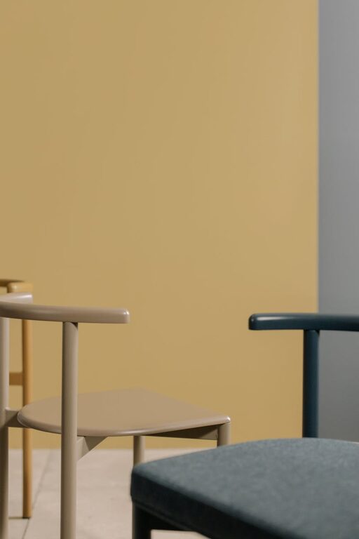
Common calm colors include soft blues, gentle greens, muted grays, and warm neutrals. However, the key is to find tones that resonate with your personal taste while complementing your home’s style.
Tips for Choosing Calm Colors
1. Understand the Psychology of Color
Different colors evoke different emotions. Here are a few calm color families to consider:
– Blues: Often associated with peace and stability, light blues can make rooms feel restful.
– Greens: Reminiscent of nature, greens promote balance and renewal.
– Neutrals: Beiges, taupes, and soft grays provide a calming backdrop without overwhelming.
– Lavenders and Soft Purples: These can add a subtle softness and elegance.
Consider your goals for each room when choosing colors. For example, blues and greens work well in bedrooms, while warm neutrals are ideal for social spaces.
2. Test Colors in Different Lighting
Natural and artificial lighting affect how colors appear. To ensure your chosen calm color looks perfect:
– Paint sample swatches on walls and observe them at different times of day.
– Note how sunlight, overhead lights, and lamps change the shade.
– Remember that cooler colors may look brighter in the evening, while warmer tones can feel cozier.
Testing helps avoid surprises and ensures the color supports the desired mood.
3. Use Color Harmonies to Maintain Calm
When choosing additional colors for furniture, decor, or accent walls, color harmony is essential. Here are a few approaches:
– Monochromatic scheme: Use different shades and tints of the same calm color for a cohesive look.
– Analogous scheme: Combine colors next to each other on the color wheel, like blue with green.
– Complementary scheme with muted tones: Pair calm colors with their opposites, but keep both soft, such as pale blue with muted peach.
Avoid high-contrast or overly bright color combos in calm spaces, as they can disrupt tranquility.
4. Incorporate Natural Elements
Colors inspired by nature often feel calming. Think of sandy beiges, leafy greens, sky blues, or gentle browns. Complement your chosen paint colors with natural materials like wood, stone, or linen textiles to reinforce a peaceful ambiance.
5. Consider the Room’s Purpose
Not all rooms benefit from the same calm colors. Tailoring your choices to the room’s function is key:
– Bedroom: Soft blues, pale greens, or gentle lavenders are excellent for restful atmospheres.
– Living room: Warm neutrals or muted earth tones create an inviting space without overstimulation.
– Bathroom: Crisp cool colors like aqua or light gray can evoke cleanliness and calm.
– Home office: Soft greens or blues can help reduce anxiety and boost focus.
6. Balance Color with Texture and Light
Calm spaces don’t have to be dull. Mixing textures such as plush rugs, smooth ceramics, and woven fabrics, along with layered lighting (ambient, task, accent), adds depth without compromising calmness.
Avoid overly glossy or reflective surfaces that might amplify harsh lighting. Mat or satin finishes often work nicely to keep colors soft and soothing.
7. Limit the Number of Colors
Too many different colors can create visual chaos. Sticking to two or three main calm colors per room keeps the design simple and peaceful. Use accent colors sparingly for decoration, such as in pillows or art, to add interest without overwhelming the senses.
8. Personalize Your Palette
While certain colors are traditionally seen as calm, your personal preferences matter most. Test various shades and trust your feelings. The goal is to create a space where you feel relaxed and comfortable.
Final Thoughts
Choosing calm colors for your home is more than a design decision—it’s a way to enhance your daily well-being. By understanding color psychology, testing shades, balancing textures, and considering each room’s purpose, you can create a serene living environment that nurtures peace and comfort.
Take your time exploring options, and don’t be afraid to consult paint samples and design tools. With thoughtful choices, your home will become a sanctuary of calm and contentment.